CEL Solicitors · Claims journey redesign
A pattern that started on one page and ran the whole site
An audit found the same four failures on every service page. I fixed them once on the fraud page, proved it with A/B tests, then rolled it out across the site.
At a glance
The problem
Service pages weren’t converting, and an audit showed the same four failures repeating on every page.
What I did
Designed one pattern on the fraud page, validated the key changes with A/B tests, then rolled it out across the site.
Where it landed
The winning variant lifted form completion by double digits, with statistical significance, and now runs on every service page. I’m happy to walk through the detail in interview.
Same problem, every page
CEL Solicitors is a UK consumer law firm on a no-win, no-fee model handling fraud and scam recovery, housing disrepair, and personal injury claims. The people who land on it aren’t shopping around. They’ve usually just lost money, or they’re living in a house their landlord won’t fix, and they’re scared they’ve left it too late. That’s the frame of mind the site had to meet, and it wasn’t meeting it.
The brief was to fix conversion on the service pages. The trap is that it sounds like a page problem: find the worst page, redesign it, move on. So before I designed anything, I audited all five core service pages against the same rubric. It wasn’t one bad page. It was the same four failures on every page, and a page-by-page fix would have patched the same symptoms five times over and missed the cause. So I stopped thinking about redesigning pages and started designing one pattern: prove it once, then roll it out everywhere.
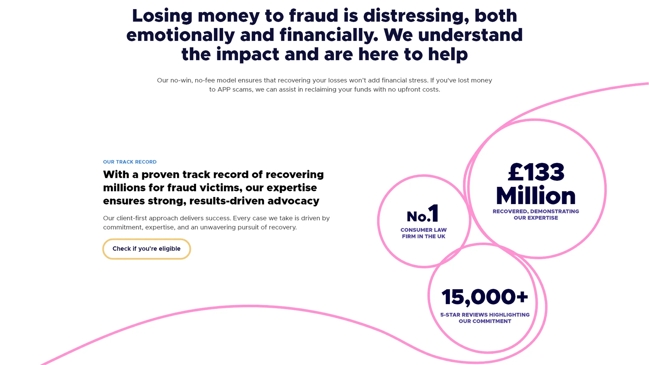
£133M+
recovered for clients by CEL Solicitors when I started writing this case study, and the figure has grown since. That’s the scale of journey this had to hold up.
What the audit found
I ran every page through the same lens: usability heuristics, accessibility and content clarity, scored keep, review or needs improvement. Using one rubric across all of them is what turned five separate critiques into a single diagnosis. Four failures, and they showed up everywhere.
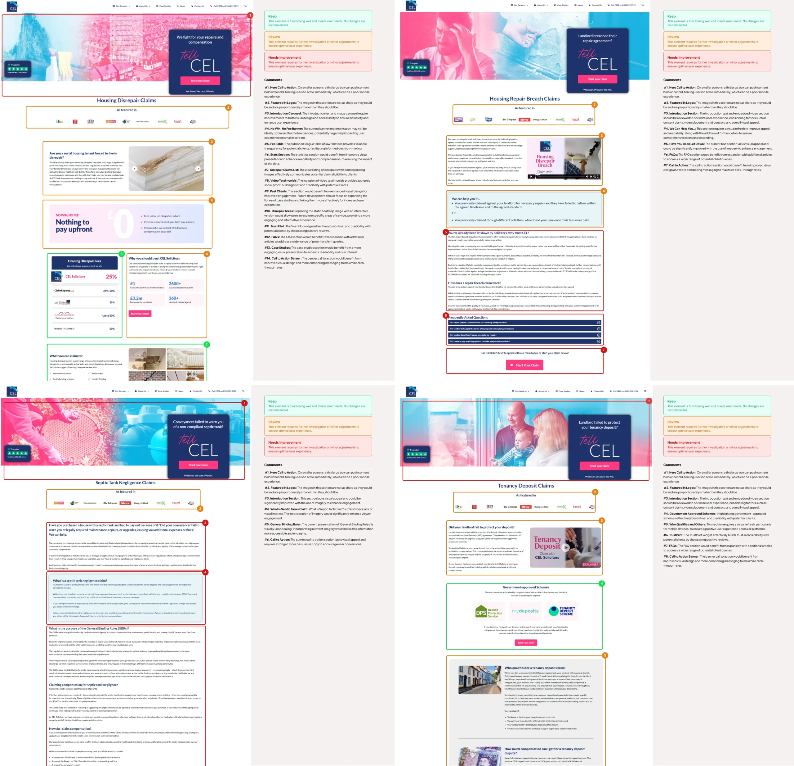
- The form buried the answer. The “Start your claim” box sat over the hero on several pages, pushing the actual content below the fold on mobile. Since many claimants arrive from a paid ad on their phone, it was the first thing they saw. Not the answer to “can you help me.” In plain business terms, CEL was paying for clicks that bounced before they reached the offer.
- The trust signals were stranded. Trustpilot in a hero corner, “featured in” logos floating mid-page, almost never next to the moment someone actually decides to submit. The reassurance existed, but wasn’t where the nerve was.
- The copy was written for someone calm. Long paragraphs, legal framing up top, the human “you’re not to blame, help is here” buried underneath. Wrong register for someone stressed and scanning.
- The numbers didn’t match. The credibility numbers were styled differently on every page, which quietly undercut the one thing that should have been doing the most persuading.
Making the case
The head of marketing wanted the fraud page turned around first. Proposing a site-wide pattern instead meant asking for more time before anything visible changed, which was a hard sell with paid traffic running.
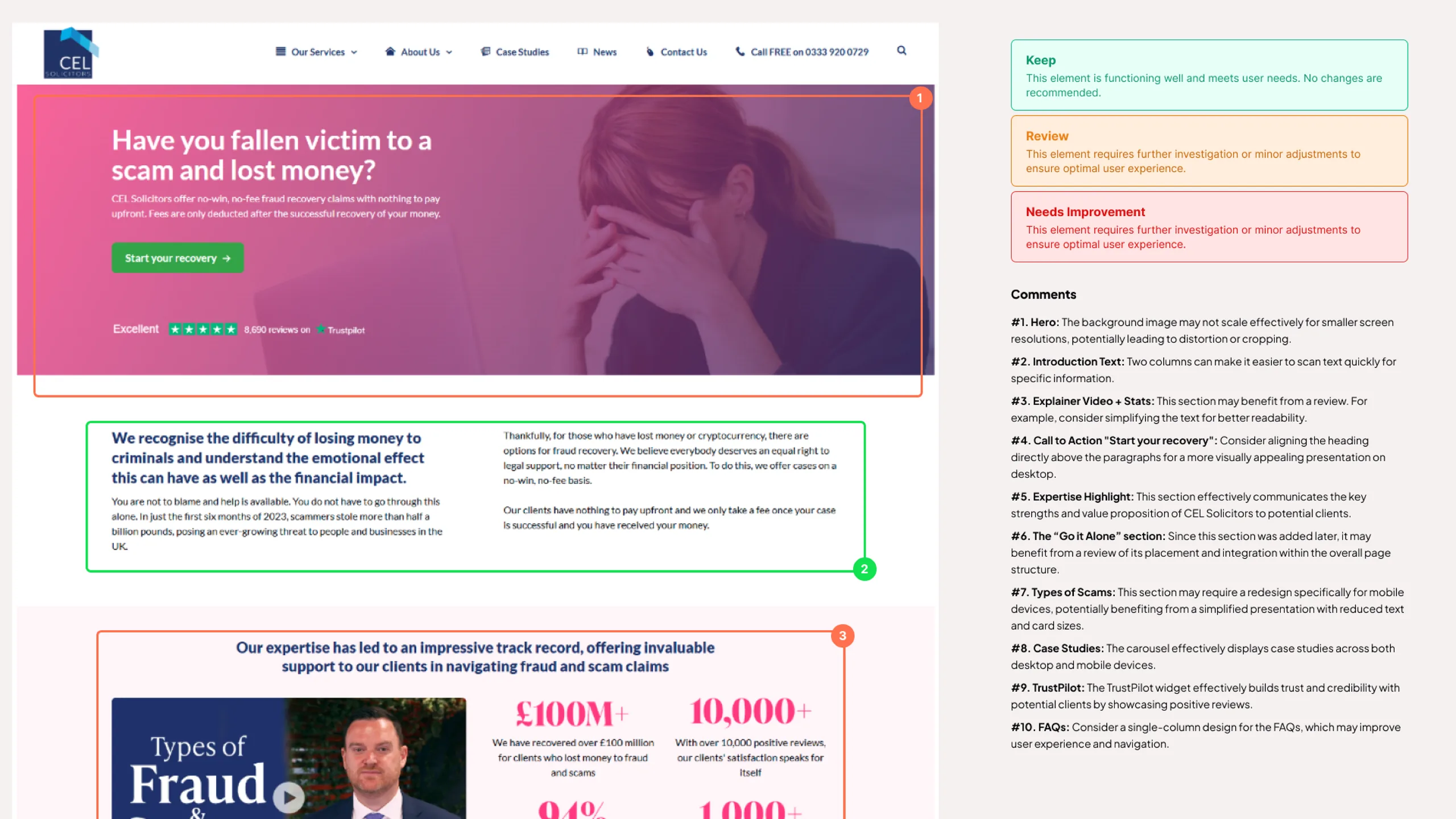
So I didn’t argue for it in the abstract. I put the audit scorecards for every page side by side in a 25-minute review and let the repetition make the case: if the same failures sit on every page, fixing one page leaves the cause everywhere else.
We agreed to pilot on fraud with the explicit goal of proving a pattern. The business kept its urgency, and I got the scope.
Building the pattern, starting from the whole journey
You can’t design a pattern for a journey you haven’t seen whole. So before I touched a single page, I mapped the entire fraud claim end to end, from the moment someone finds CEL, usually mid-crisis and straight off a search or a news mention, through eligibility, triage, and the long stretch of case management, to the outcome and what happens after it.
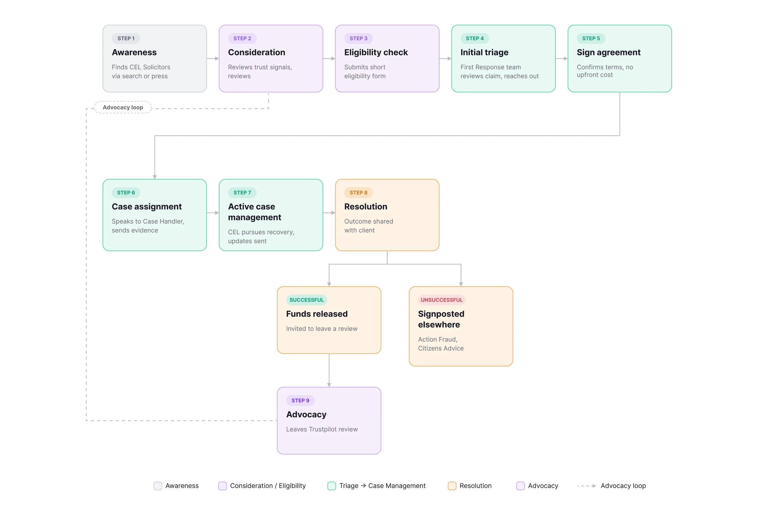
Mapping it whole showed me two things a page-by-page view never could. First, the emotional shape of it: where trust has to be won, early, before anyone fills in an eligibility form, versus where it has to be held, through the quiet, anxious weeks of case management, when nothing visible is happening.
Second, it forced me to design the paths most sites quietly ignore: the unsuccessful outcome, where someone we can’t help is still signposted to Action Fraud and Citizens Advice rather than left at a dead end, and the advocacy loop, where a happy client’s review becomes the first trust signal the next frightened person reads. That loop is the whole reason trust signals mattered so much. The output of one journey is the input to the next.
The pattern itself was the four audit failures turned the right way round: lead with the answer to “can you help me,” put the trust signals where the decision actually happens, write for a stressed person scanning on a phone, and make the numbers consistent enough to carry real weight. I placed each fix where analytics, interviews, surveys, session recordings and reviews showed people really falling away, not where I assumed they were, and treated WCAG 2.2 as part of the build, not a clean-up pass at the end.
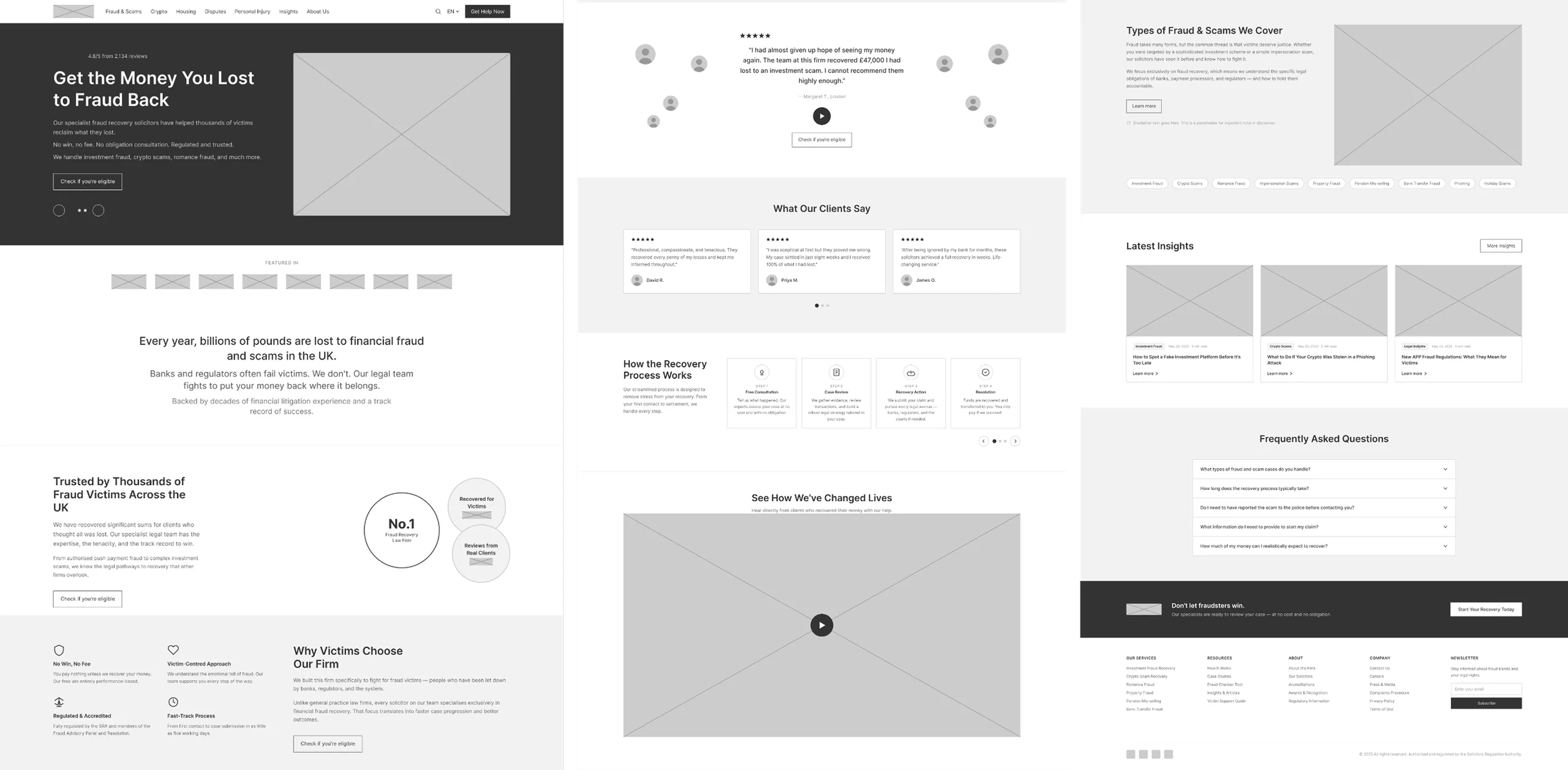
And I built it all on the fraud and scams service page first. That was where the business wanted to start, and I agreed for a reason of my own: it was the hardest place to be wrong. Fraud is CEL’s flagship vertical and carries the most paid traffic, so if the pattern held there, under real pressure and real spend, it would hold anywhere. Prove it where it counts, then scale.
The form, where the pattern is sharpest
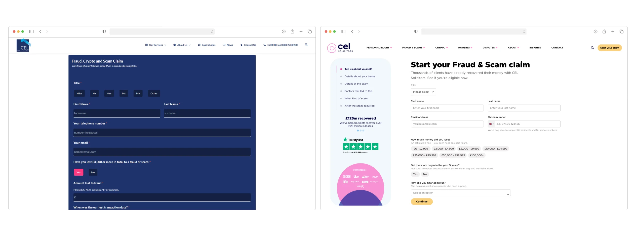
The old one was a dark, dense wall on a single scroll. It asked for things like “an exact amount lost” from someone who has just lost money and may not have a clean figure to give. That’s a lot to ask at the worst possible moment, and it’s exactly where anxious people quietly give up.
The redesign didn’t make it prettier so much as make it kinder. I broke it into steps with a trust rail that stays visible, and changed two small things that matter more than they look.
Banded ranges instead of a free-text box
“An estimate is fine. You don’t need an exact figure.”
A softer qualifying question, not a hard yes or no gate
“Not sure? Give your best estimate. Answer either way and we’ll take a look.”
Neither is a visual change. Both remove a moment where someone stalls. That’s the pattern in miniature: meet the person where they are, and take the friction out of the exact spot where fear turns into a closed tab.
Rolling it out
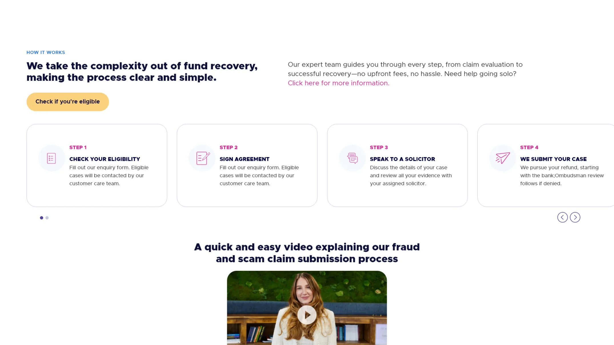
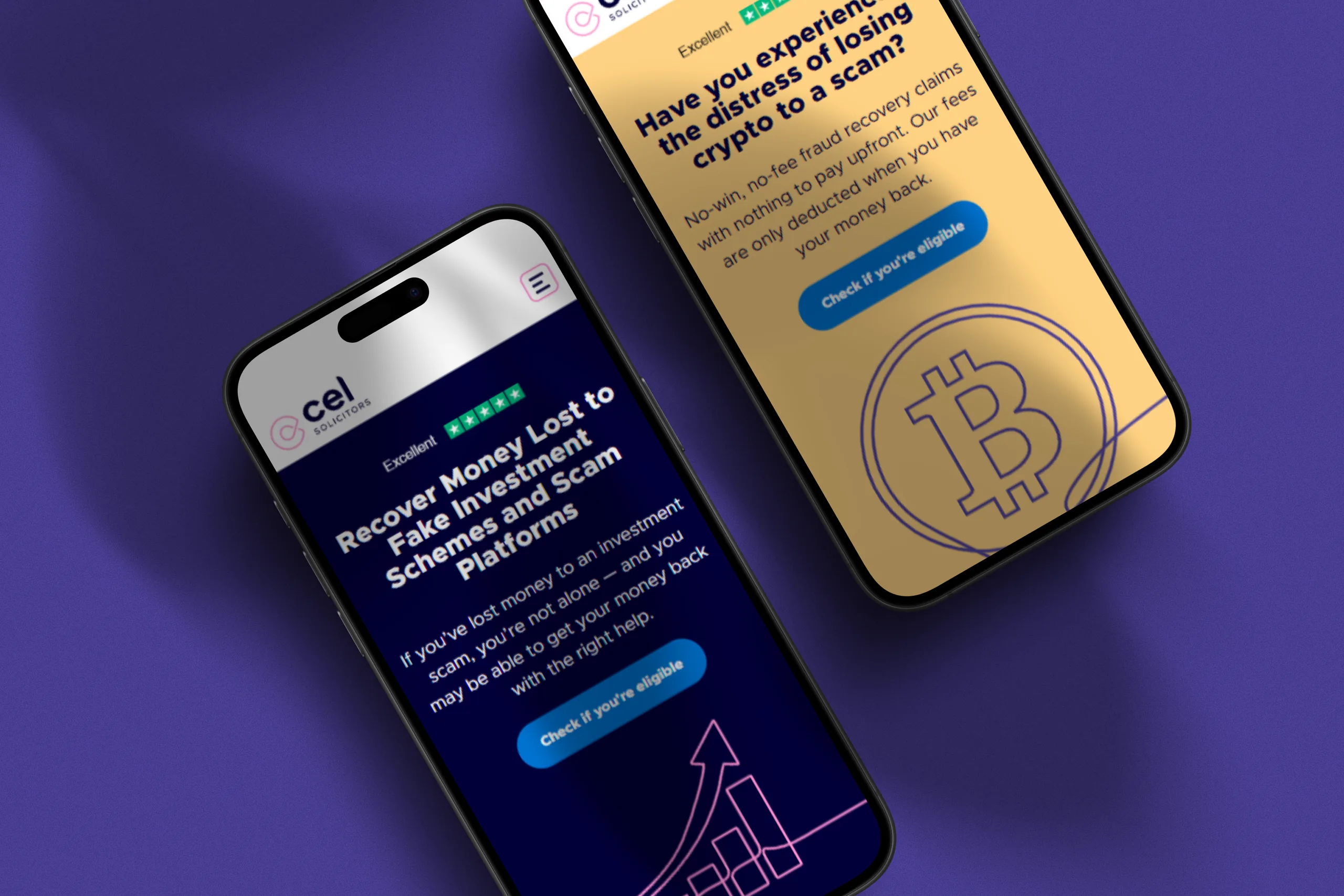
The fraud and scams service page was the pilot. Once it held up, I extended the same pattern (layout, trust-signal placement and content approach) across the rest of the site: crypto, housing, disputes and personal injury. At that point the fraud redesign stopped being a redesign and became the template the whole site runs on.
That’s the part I’m proudest of, and it’s the part that’s easiest to verify. You can open any of those pages and see the same thinking at work.
Shipping the rebrand and the redesign together
A rebrand landed at the same time, and together with the business we chose to ship it alongside the UX changes. People saw one change instead of two, and a new look never sat on top of an unfixed journey. I led the UX and website redesign through that combined release.
The cost was attribution: with the look, the words and the flow all moving at once, it’s hard to say which one moved a number. That’s why I ran the changes that mattered as controlled A/B tests, so those results stand on their own. The new identity was the context I designed inside, not the thing I was measuring.
Results
Each change traced back to a specific drop-off point in the analytics and the research, and the key ones were validated with controlled A/B testing before rollout. Behaviour, not opinion, deciding what shipped. I can’t publish CEL’s exact performance figures, so what follows is how each change was tested, which I’m happy to walk through in detail.
A/B tested
Trust signals moved closer to the point of submission. The change I’m most confident about. It ran as a controlled A/B test (n = 3,100), with the primary metric and sample size fixed before launch and the test run across full weekly cycles. The variant lifted form completion over control by double digits, with statistical significance, so it shipped, and it became the default on every service page.
A/B tested
Content rewritten for a stressed reader, not a browsing one: shorter, plainer, clearer next steps. It ran as a controlled A/B test against the original and won with statistical significance, so it went live.
Directional
The full journey, remapped end to end, tracked in GA4 across the launch window. I read this as directional, with the two controlled tests above as the real evidence the journey got stickier.
And the outcome that outlasts the numbers: the fraud redesign became a pattern the rest of the site now runs on. One page, turned into a system.
What I’d do differently
Analytics tells you where people leave. Interviews often tell you the thing that made them leave happened a step earlier.
I had good research to lean on: reviews, session recordings, interviews and surveys. But the site needed fixing fast, so I let the drop-off data lead. If I did it again, I’d hold the qualitative and quantitative against each other properly before deciding where the fixes went. I think that triangulation would have sent some of the effort somewhere slightly different.
See the live fraud and scams page
It’s been updated since launch, so it won’t match these screens exactly.